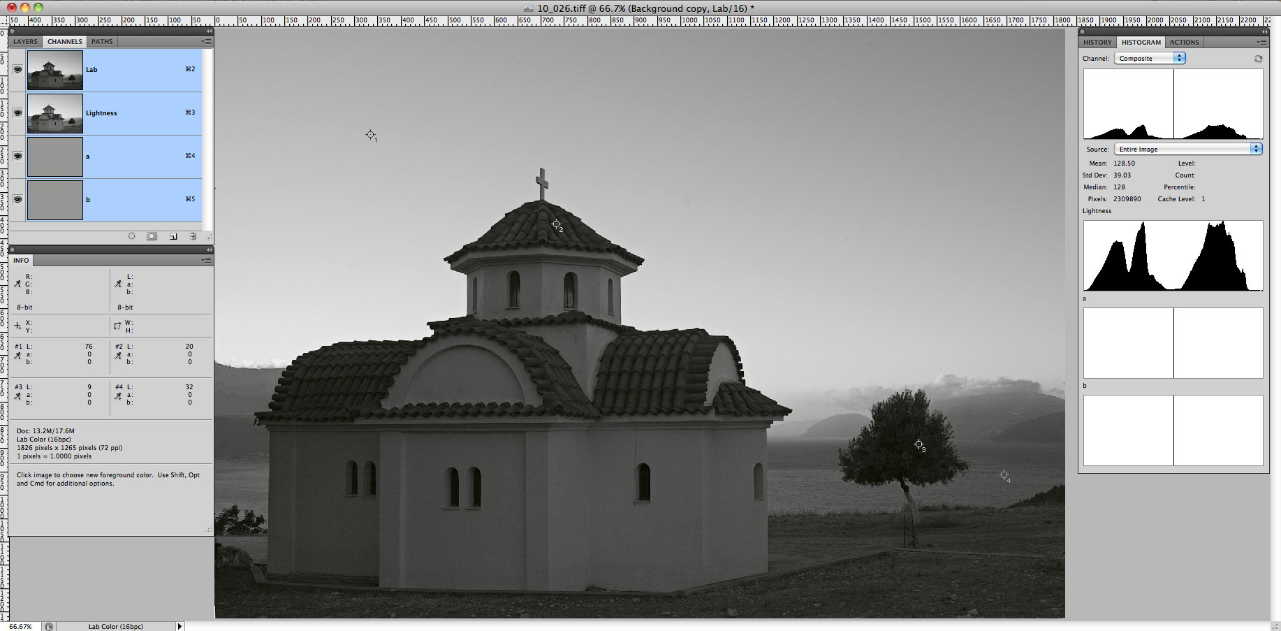
Once in a while one may want to adjust L channel viewing it separately. The rub is that to do this without using extra layers one needs either to use grey Lstar profile as grey working space in Photoshop Color Settings (Cmd/Ctrl-K), or to switch on Show Channels in Color in Photoshop Interface Preferences (Cmd/Ctrl-K). Otherwise the brightness and contrast of the L channel display are wrong.
Here are some screen shots to illustrate why one might care.
For quite some time we were suggesting that floating point implementation of demosaicking algorithms allows for higher quality results. Incidentally, some programmers who vigorously argued for years insisting integer processing is quite sufficient are now starting to code their demosaicking in floating point too. Here is a comparison of the results of original AHD demosaicking algorithm implemented using floating point and integer arithmetics.
With the existing diversity of RAW converters and their algorithms, there is the problem of choice: which converters are better (and for which purposes). An evident methodology is often encountered in internet forums: take one or several images, process them using different converters/algorithms/settings and compare them visually. The result often looks like this: image P should better be processed using algorithm Q, and image A is better handled by algorithm Z with option f+.
Moreover, it is simply wrong to analyze things in terms worse or better . The correct formulation is closer to/farther from the initial image .
The problem is that here we deal with a complex system, which includes
The photographed object and light.
The light path in the camera with lens aberrations and light scattering within the camera.
The sensor with all construction features: anti-alias filter, color bayer filters, microlenses, etc.
The current methods used to determine the sensitivity of digital cameras are not based on the RAW data coming from the sensor; rather they are based on the results of processing the RAW in a converter (be it an external converter or in-camera).
This approach, with all its simplicity, is in fact based on the properties of the RAW converter and on the transformations it applies to RAW data. In particular, the converter can introduce hidden exposure compensation, change the tone curve, and so on. The sensitivity of the camera resulting from such a procedure is a pretty arbitrary value. The matter is discussed in good detail in Wikipedia, in the .
This approach allows the camera manufacturers to enjoy all sorts of tricks while stating the sensitivity, say cameras from different manufacturers but having the same rated sensitivity behave wildly different when it comes to photographic latitude. This means that switching between different camera bodies one often needs to re-adapt, changing the way he applies exposure compensation.
A simple experiment that takes no additional equipment other than already existing camera and lens allows to accurately determine how the camera exposes, that is:
which level of signal (in terms of RAW data) is obtained while setting the exposure by the exposure meter;
what headroom in highlights is left, i.e. how many exposure stops are between the middle gray and sensor saturation.
Why are photographers compelled to suffer the discord of RAW formats?!
During the last 10 to 15 years, digital photography forced the film out of nearly all the domains. End users purchased hundreds of millions of digital cameras; and that is not including the cameras sold integrated with cellular phones. Such a huge industry can't exist without standards and such standards appear to exist. They cover the storage media (various flash cards), and image format which happens to be JPEG. Currently JPEG is the most widely used image format and its image quality and size satisfy the overwhelming majority of users.
However it is not always what professionals want. By professionals we do not mean just professional photographers. The list includes designers, pre-press staff, archivists, photo banks and many others. It often happens that JPEG format is also deemed less than appropriate by advanced amateurs. That is why nearly all digital cameras that are positioned by manufacturers as professional or semi-professionals models (as well as all current dSLR cameras) suggest an alternative format, the so-called RAW. For a casual onlooker it may appear that RAW is also some kind of a standard format that delivers better quality quality for pros.
This small article is to show that the matter is much more complicated. At the current stage the situation with RAW format is not just bad but really dreadful and continues to spiral downwards rapidly. This affects mostly professionals while less demanding amateurs simply enjoy the progress of digital.
The question that needs an answer is, for what purpose is the module designed. I can think of four different approaches to acquisition.
I want the module to do nothing more than open the file without damage. I understand that it will probably be flat and colorless if I do this. I intend to fix the problems in Photoshop.
Although I will refine the image in Photoshop, I would like to be able to make quick, obvious moves in the acquisition module to make life easier later.
I am not interested in the very best quality. I will do whatever is possible in the raw module but I will not work in Photoshop afterward. So I would like to be able to get attractive color from the module.
I want to make the image as perfect as possible in the module. I will intervene later in Photoshop only as necessary.
After finally finishing reading Fairchild s I started to get deep into thought and some empirical things became clear.
Color Contrast
In the photographical community it is pretty much a common place that if you show the viewer two pictures, one with normal colors and one with an increased saturation, the viewer will in most of the cases pick the one with the higher saturation (if it is, for example a landscape scene) as the more natural one (of course if saturation is increased in the reasonable limits).
I could not quickly find the wording of this effect in books by Margulis, although I was almost certain that it was there in one way or another: in his book ) this rule (increasing the a-b axis contrast) is used starting with the very first example.
While preparing for my summer trip to Altai, I attended to choosing the telephoto lenses I was going to carry. I needed a regular telephoto lens for shooting water attractions (Katun is very large river and the target can be very far away) and an extra long reach lens for shooting the full phase of the solar eclipse.
The goal was to select a 400 mm as a long lens, and as much as possible for the extra long one. After looking around and asking some friends I found the following possibilities for a 400mm with Canon:
EF 400/5.6
EF 300/4 + TC1.4
EF 200/2.8 + TC2
EF 70-200/4 + TC2
EF 135/2 + TC2 + TC1.4
Surprisingly, even the last option on the list (the one with two teleconverters stacked) did not seem hopeless: I tried that option for film a while ago, and it was comparable with a 70-200/2.8 with a 2x TC.
As it was shown earlier the direct application of exposure to the right method (ETTR) without preliminary scene analysis and evaluation often results in a major underexposure which in turn causes poor details, noise, and artefacts. In order to evaluate the necessary depth of tone correction for such underexposed shots we will use the following natural method we will return the zones containing details of high visibility (those are zones from IV to VI) to target density values. Such a move makes sense because in order for those details to be really visible, they need to be in those zones.
In the photographic community, the common perception is that the exposition scale is symmetrical. The perception dates back to Adams: the Zone V is in the middle of the range, with 5 zones above and below it, top and bottom being symmetrical: there are 2 zones each way containing details, then one more each way with traces of textures, with the final two (one each way) which are respectively completely void white and solid black. The 2x (1eV) changes in brightness correspond to the transition between the zones.
The photographic zone step wedge is not visually (perceptually) even. For instance in the Kodak Q13 grey wedge (the top scale on the image to the left), where the distance between the two neighboring patches is 1/3 eV, we can clearly see that in the lighter part, this distance between the patches seems visually large, and in shadows visually small, as if the steps are compressed. The Q13 wedge encompasses Zones I through VII, although not representing the brightest part (further on, we will see that they cannot be represented at all by an evenly distributed wedge).


Recent comments